The Mathom-house it was called; for anything that Hobbits had no immediate use for, but were unwilling to throw away, they called a ‘mathom’.
–The Fellowship of the Ring; Prologue
Friday! Another week is over, the weekend is looming and its time to head on over to take a pit-stop here at the Mathom-House, where there's a whole lot of awesome-ness in a hole in the ground to celebrate! This week we'll be looking at the Hobbit/LOTR artwork of Otis Frampton. I stumbled on this guy's work a few months ago and couldn't get over just how good it is. His art has an amazing, stylized look, yet the details don't suffer for it. Frampton also does a great job of imbuing his images with atmosphere. Take a look for yourself:
Bilbo and the Dragon
The thing I like best about this first image is the sheer size of Smaug . . . the guy is HUGE, and Frampton did a great job of making the dragon's tail disappear into the haze of the chamber. Like I mentioned above, effects like that lend a sense of depth and atmosphere that make this picture really fun.
More great art after the break:
Legolas and Gimli
Not much needs to be said about these too . . . they speak for themselves. But take a second to notice what I was talking about earlier . . . very stylized characters, but a lot of detail thrown in, like on Gimli's helmet and Legolas' quiver. Good stuff.
Frodo and Gandalf
Frodo looks seriously creeped out in this picture (as he should, if Sting's glow is any indication). I like Gandalf, but he definitely has a Mr. Miyagi thing going on.
Boromir and Aragorn
'Nuff said.
Arwen Undomiel
This is actually my favorite image of the whole bunch, and again its due to the feeling of depth and space you get with the multiple layers . . . Arwen and the tomb up front, then columns and trees further back, then falling leaves and finally, WAY in the back, the blurred out buildings of Minas Tirith. It has this open, empty feel that really amplifies the mood of the image.
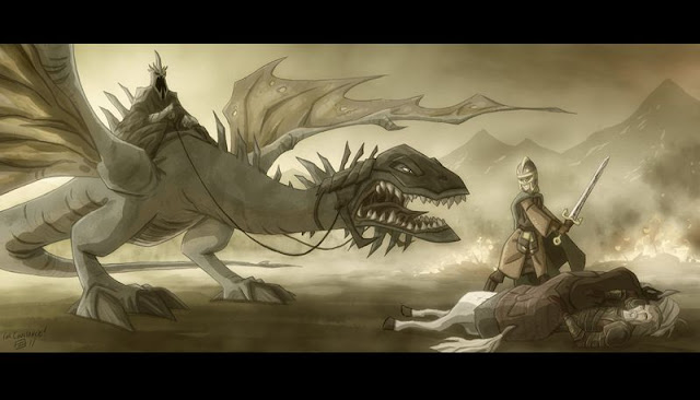
The Witch-King and Eowyn
Now, I have to admit . . . the Fell Beast above isn't my favorite, but Eowyn is fantastic, as is the Witch-King.
Again, just a plain old awesome picture. Gandalf is pretty simple, but I was really impressed with the effects Frampton used to created the flames around the Balrog, and the sense of light coming from the monster. Good stuff.
Well, thats it for this week. One last quick note for anybody who's interests extend beyond the Hobbit and LOTR: Frampton has a lot of other sweet stuff at his site, ranging from Star Wars to worlds and characters from his own imagination. Check it out!
Next week: Gandalf, Galadriel and why everybody should just shut up about them.


No comments:
Post a Comment